// UX Research & Redesign
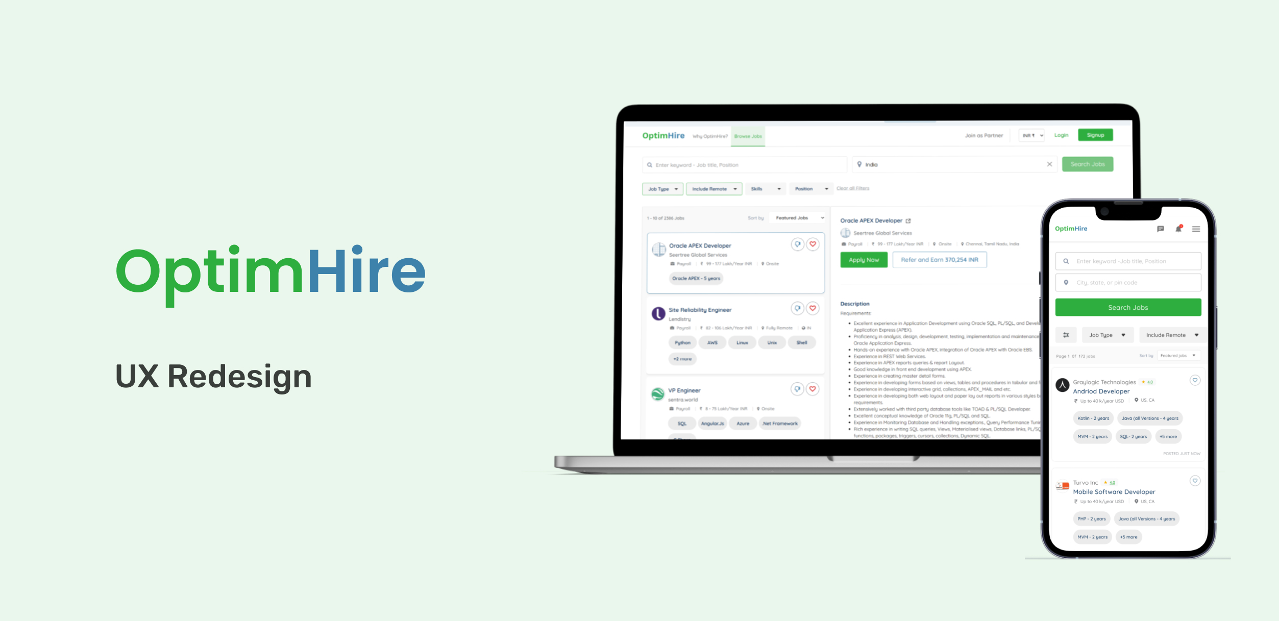
OptimHire Candidate Portal — UX Redesign & Usability Testing
OptimHire Candidate Portal: UX Redesign & Usability Testing. OptimHire is a global platform connecting employers, job seekers, and recruiters. The Candidate Portal faced serious usability challenges — cluttered interfaces, high profile-completion dropoff, and missing feedback states — that hindered engagement and task completion. This project led usability testing with 11 participants before redesigning 6 core UI surfaces, achieving a 48% increase in application rate.
Role
UX/UI Designer
Duration
3 months
Team
Cross-functional — Designers, Engineers
// Challenges
- >Interface clutter overwhelmed users — 9 of 11 participants cited slow, confusing layouts as their primary frustration
- >5 of 11 candidates couldn't complete their profiles due to mandatory fields and broken form logic
- >New users wanted Google login to avoid password friction — no social auth existed
- >No real-time feedback left users uncertain whether actions (uploads, applications) had succeeded
- >Distracting non-essential features diverted attention from core tasks: job search and application
- >Missing 'withdraw application' option frustrated users who changed their mind after applying
// Solutions
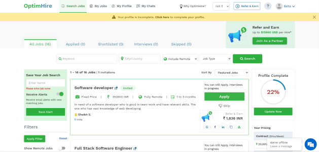
- >Landing page: Simplified layout with fewer, more meaningful CTAs — removed irrelevant client signup banner, focused entirely on job seekers
- >Search Filters: Replaced long expanded list with collapsible filter chips, clear active-filter indicators, and single-click reset (Hick's Law)
- >Job Cards: Cleaner layout showing role, company, salary, location — added save and like/dislike actions aligned to Fitts' and Scarcity Laws
- >Search UI: Typeahead suggestions with role/skill filtering and structured placeholders for first-time users
- >Header: Trimmed from 7+ actionable items to essentials only — jobs, signup, and key account actions (Miller's Law)
- >Job Tracking: Clean progress indicator with tabs for applied, invited, and shortlisted stages — replaced cluttered mixed-content view
// Process
User Research & Surveys
Conducted surveys and interviews with active, inactive, and new users using the 'think aloud' method to surface real mental models and expectations
Moderated Usability Testing
11 participants (8 desktop, 3 mobile) — average task completion 70%, identified profile dropouts, search friction, and onboarding blockers
Synthesis & Design Goals
Mapped friction points to 3 design goals: improve task completion for onboarding and job search, reduce bounce rate from first-time users, enhance navigation clarity with progressive disclosure
Wireframes & Prototyping
Iterated wireframes in Figma across 6 UI surfaces — validated feasibility with developers at each iteration
Redesign Delivery
Delivered redesigns for landing page, search filters, job cards, search UI, header, and job tracking — all validated against UX laws
// Key Decision
Redesign a complex job portal where every UI section had distinct friction points — clutter, missing feedback states, broken form logic, and onboarding dropoffs
Ran moderated usability testing with 11 real participants before writing a single design brief — letting task-completion data determine which pain points to prioritise
48% increase in application rate — all 6 redesigned surfaces grounded in UX laws (Hick's Law, Miller's Law, Fitts' Law) with documented before/after rationale
// Before & After
Landing Page
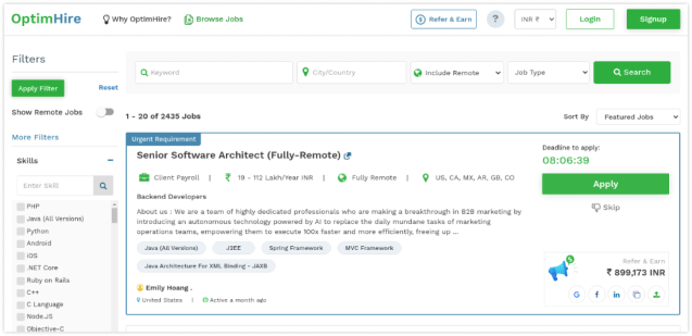
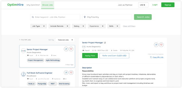
Clearer call-to-actions and breathing space improved first impressions — removed irrelevant client signup banner, focused entirely on job seekers
Search Filters
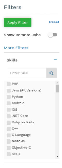

Reduced cognitive load with collapsible filter chips — aligned to Hick's Law, providing a faster, cleaner way to tailor search results
Job Cards
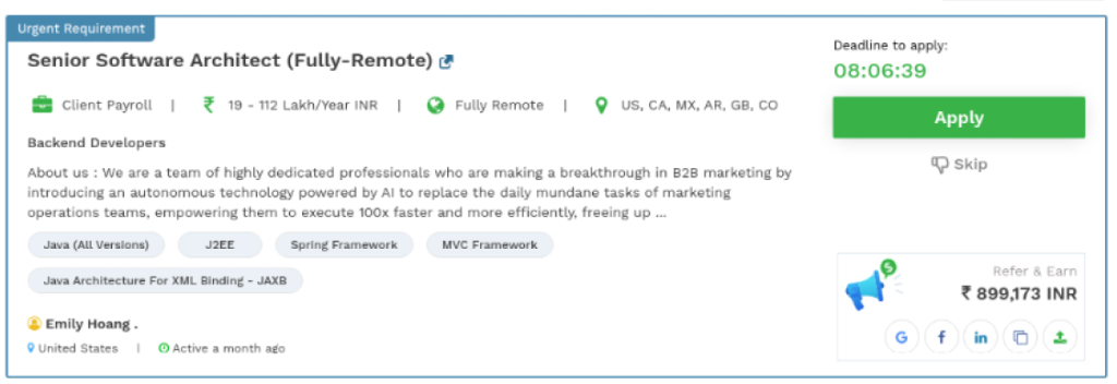
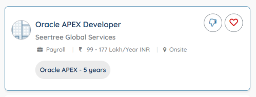
Improved clarity and decision-making — save and like/dislike actions aligned to Fitts' Law and Scarcity principle reduced friction
Search UI

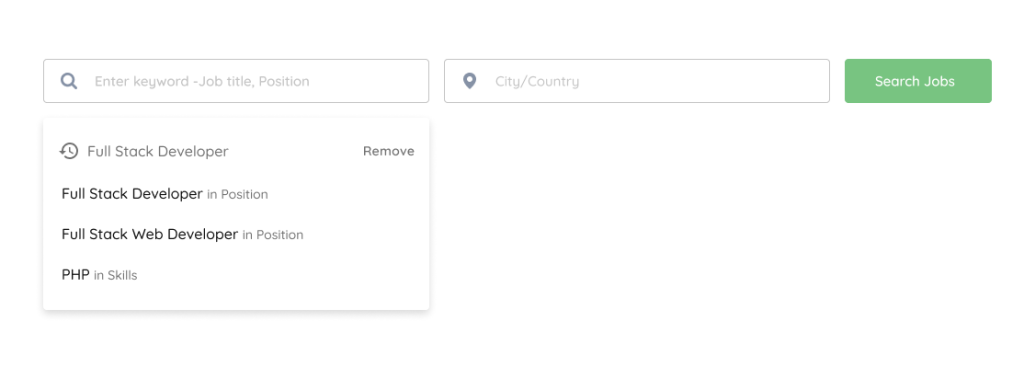
Typeahead suggestions and role/skill filtering improved relevance, especially for job seekers using niche skill queries
Header


Trimmed from 7+ items to essentials — applying Miller's Law streamlined the UI and improved cognitive accessibility upfront
Job Tracking
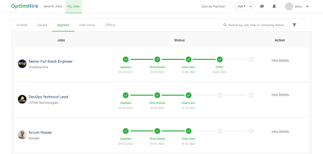
Clean progress indicator with separated tabs (applied, invited, shortlisted) made job follow-ups manageable and confusion-free
// Outcomes
48% increase in application rate post-redesign
Profile completion unblocked — mandatory field friction resolved for non-IT users
Header reduced from 7+ items to essentials — cognitive load significantly cut
6 UI surfaces redesigned: landing page, filters, job cards, search, header, job tracking
// Reflection
The usability testing before the redesign was the defining decision. Rather than redesigning on assumptions, 11 real users showed exactly where they were stuck — cluttered layouts, absent feedback states, broken form logic. Applying UX laws gave every design change a defensible rationale: Hick's Law for the filter redesign, Miller's Law for trimming the header, Fitts' Law for job card actions. The before/after structure made the impact tangible and the decisions transparent.